Leaflet Project and Pitch
Click here to view my completed leaflet and pitch
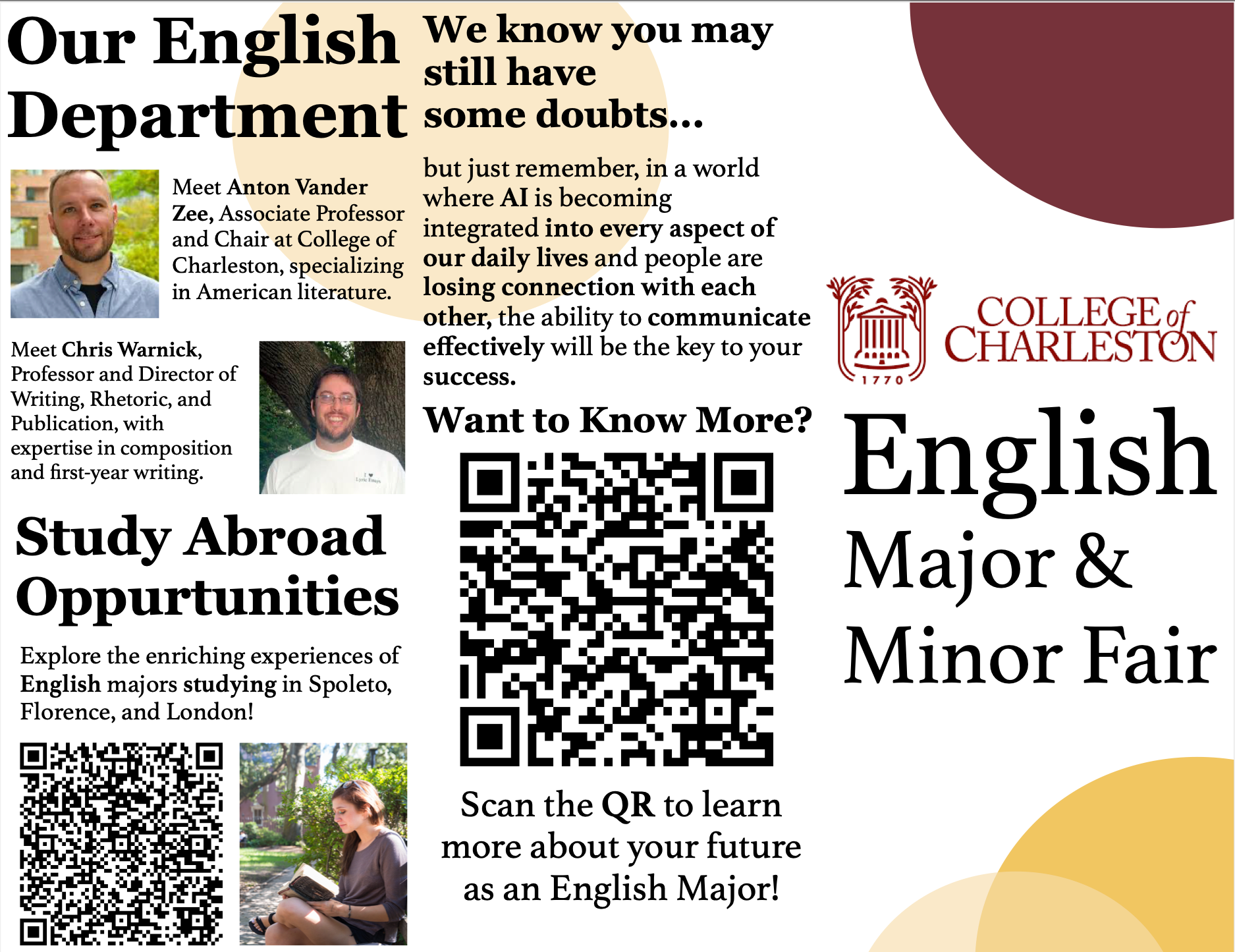
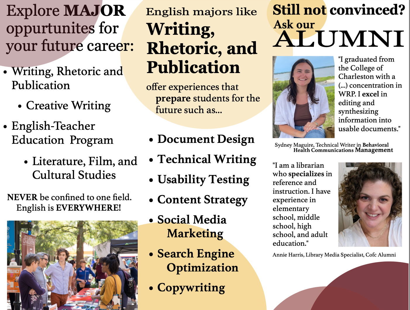
How I Designed a Leaflet for the College of Charleston's Major and Minor Fair
Simplicity was a must in the creation of my leaflet, since I knew audiences would likely give the leaflet a quick skim before setting it aside. Bulleted points ensured simplicity while still relaying necessary information. A QR code gave those seeking more information an accessible way to do it. And my Alumni interviews gave some credibility to the claims that I was making. Overall, my design choices prioritized user accessibility by keeping information short and stamping out the uncertainty that follows students selecting a major.

Step one was asking the director of Writing, Rhetoric, and Publication (WRP), Chris Warnick, relevant questions about what content he NEEDED in the Leaflet. What images were acceptable? What information was incredibly necessary? What colors would follow the College of Charleston (CofC) branding? And especially, who was the most anticipated audience? His answers then influenced the wireframe of my leaflet—my overall design and content decisions.
My project ended with a finalized z-fold leaflet with 6 panels and a pitch directed to the English Board. My pitch emphasized my choices, my peak moments, and my process of completing the project.
It was my job to appeal to audiences that would most likely engage with the leaflet. Using design tactics, inserting carefully chosen rhetoric, and adhering closely to the CofC branding allowed me to achieve this goal successfully.
Learning new software like Affinity and organizing my leaflet to tell a story proved to be the most challenging parts of this project. I overcame them by allocating more time to Affinity and researching examples of similar leaflets from past major & minor fairs.
As someone who primarily writes, I found that design also requires you to understand your audiences and appeal to them by making effective choices. The project opened my mind to the possibilities of engaging with users by combining these two mediums. It also revealed a new goal: find a career that allows me to build on my design/writing skills so that I can learn to better empathize with and have a conversation with my reader.
The leaflet combined two passions of mine: appealing to audiences through rhetoric and appealing to audiences through design tactics. I also especially loved learning Affinity, and I am happy that I will be able to add it to my already heavy toolbox of software knowledge.
"I thought you did a really good job of stepping through your design." - Prof. Warnick
"I thought it was a really professional pitch that demonstrated your user awareness and your client awareness." - Prof. Warnick